This Office Depot is buried in the middle of a strip mall. Bigger storefronts on both sides, lousy drive-by visibility, mostly blocked by landscaping until you’re right in front of the store.
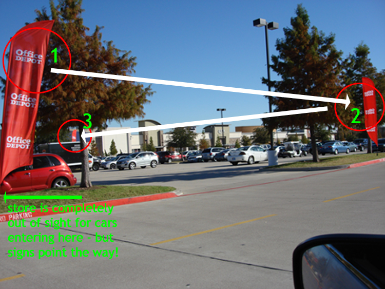
But look at their clever use of banners. They put the first pair way out at the edge of the shopping center…before you can even see the store!
(Click to zoom on all of these)
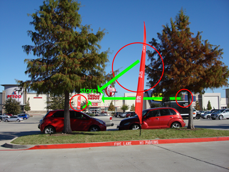
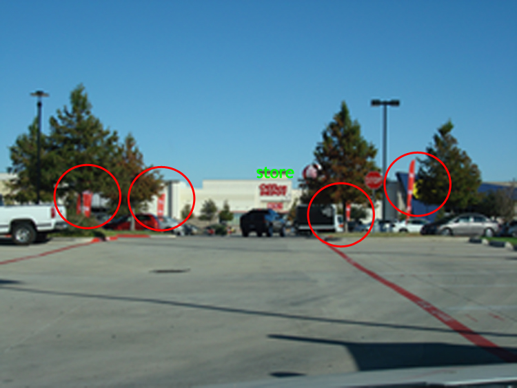
It’s like stepping stones right to the door of the store:
Then you notice yet more banners that take you by the hand and point the way…
…right to their door.
The lesson here is that a single banner right in front of your storefront is probably too little, too late.
Signage in general is often underutilized. Folks slap a single big sign on the facade and that’s it.
We often create banners like these for clients with poor drive-by visibility – like a wellness center in the middle of a strip center like this one. Or a yoga studio or healthy lifestyles practice on an upper floor with no ground-level visibility at all. They give an instant visibility boost at an affordable price, and they look sharp for a long time so you’re not having to buy new ones every few months.
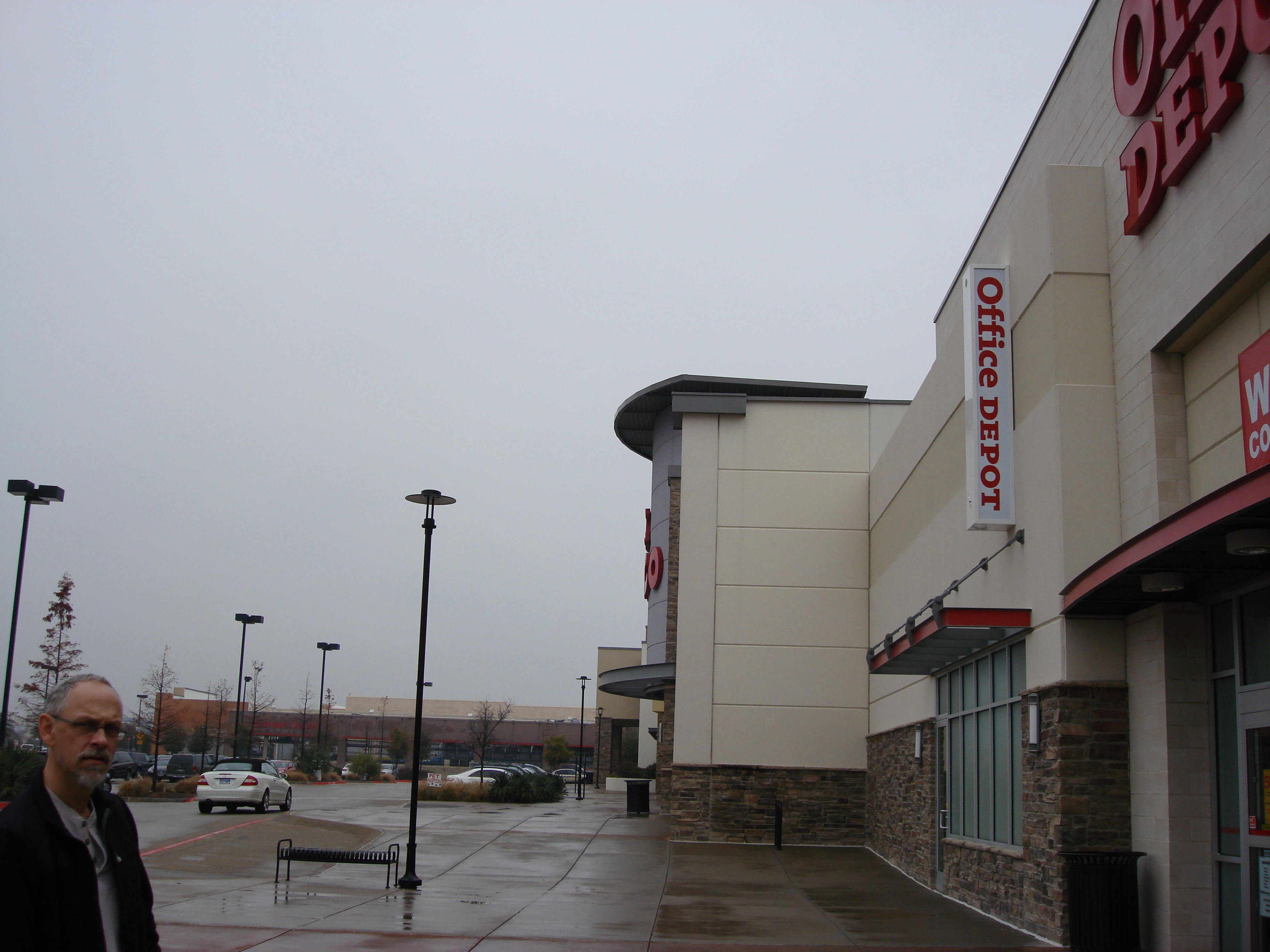
Here’s the other signage detail I wanted you to see: the perpendicular sign on the front of the building. It’s fairly low-down on the facade, clearly designed to be visible to pedestrians and to cars approaching from either side. Notice that no other store makes it so easy for customers to spot their destination.


