This week, we review AIPM’s email marketing for its Get Well card deck. We highlight several areas where they’ve done a great job of enticing the reader, and flag several opportunities for further improvement.
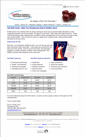
Here’s the original marketing email – just click it for a larger version:
Now, let’s look at what works…
1. Subject line
![]()
The purpose of the subject line is to create enough interest in the reader that he or she will want to take a peek at the actual email.
The risk in using this kind of subject line is that it creates great expectations. You don’t want to disappoint your reader. So if you’re thrilled about the latest feature on your new treadmill line, avoid this unless it’s really cool.
In this case, it works. Most wellness products and services for employers are anything but fun and creative.
2. A great tagline
“An apple a day isn’t enough.” It really pops off the screen. That’s the perfect tagline for this organization. And the Get Well cards fit perfectly with that message.

Brilliant!
3. Fun product idea
The concept of card decks containing a different physical activity on each card isn’t new. However, the combination of a lifestyle activity and tip is clever – and targeting employers is smart.
This card deck is an affordable, unintimidating and low-tech way to encourage employees to take the initiative on wellness. It’s refreshing to see a workplace wellness product that doesn’t require a competitive element, too.
Our only quibble – and we’re still waffling on this one – is whether “Stay Well Cards” would make more sense than “Get Well” cards.
4. Good use of white space and bullets
The overall layout is clean and easy to scan. That’s important, because few people will actually read a marketing email closely. And too much copy presented too densely is a very common problem.
…And how this marketing email could be even more effective:
1. Sender – who’s AIPM?
![]()
Always use an immediately recognizable and meaningful sender name. If it creates interest and curiosity without appearing to be spam, so much the better.
In this case, we’ve actually ordered materials from the American Institute for Preventive Medicine – and even we didn’t recognize AIPM. We also wouldn’t suggest using AIPM’s president’s name, because most readers won’t recognize it either.
A few alternatives: American Institute for Preventive Medicine (it’s long, though). Or AIPM Workplace Wellness. Or The Get Well Workplace Card Deck.
We would also test “American Preventive Medicine Institute” and shorter versions like
“American Preventive Medicine” and “Preventive Medicine Institute”. Some of these might appear to be spam to readers, so watch your spam reports and unsubscribes closely.The tagline is great – so another approach to test would be using “An Apple A Day’s Not Enough” as the sender name.
2. Lead with the lead, above the fold
The first paragraph buries the most interesting points in the middle of the text. The most compelling information should come first.
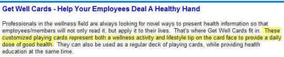
Plus, many email viewers don’t automatically display graphics. So the first couple of lines of text really need to count, since that may be all that persuades readers to scroll down or actually open the email.
You can improve this paragraph without doing a major rewrite. For example, instead of: “Professionals in the wellness field are always looking for novel ways to present health information so that employees/members will not only read it, but apply it to their lives. That’s where Get Well Cards fit in. These customized playing cards represent both a wellness activity and lifestyle tip on the card face to provide a daily dose of good health. They can also be used as a regular deck of playing cards, while providing health education at the same time.”
Simply say something like:
“Get Well Cards: a deck of 52 unique playing cards gives employees a daily wellness activity and lifestyle tip. Turn a daily dose of good health into family fun!”
3. A clickable graphic
This product cries out for a clickable graphic. The card looks intriguing – but it’s too small to read. And nothing happens when you click on it!

Actual Size
Much better: first, make the card image in the email bigger. You’ve got plenty of room now that you’ve tightened up the first paragraph.
Then make it clickable by adding a hyperlink to the full-size image on your website. That way you provide a close-up version to anyone who clicks on the image (and many readers will indeed do just that, especially because the text in the graphic is not legible in the actual email).
4. Identify key features, benefits and advantages
Given the attention span of the typical email reader, limit yourself to three or so key uses for a product like this one. Avoid the temptation to make a “laundry list” with everything you can think of.
For example, including a deck in new employee orientation packets sounds promising. Filling up brochure racks and direct mail campaigns sound like vague throw-ins that we could easily omit.
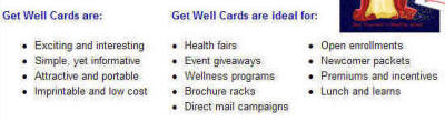
In fact, we’d like to see abbreviated real-life examples here of how AIPM’s customers are using these, and why they say they like them. Several of these examples feel like they were created out of thin air by a marketing department.
5. A mini-testimonial
This is such a fun product! There’s got to be an AIPM customer who’s used these cards with employees and would love to share their story.
6. A stronger call to action
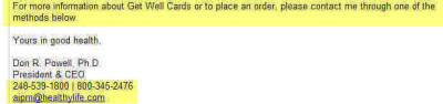
Your call to action spells out exactly what you want your reader to do next. Here, the call to action is the last thing on the page, and it’s bland: “For more information or to place an order….”
Now, customers should be able to buy this card deck online. It shouldn’t require an email or phone call.
However, if you don’t have any e-commerce capabilities at the moment, you’ve still got lots of ways to improve this call to action.
For example:
Sharpen the offer and remove any perceived risk: “Order your deck by 10/7…satisfaction guaranteed!”
Place the call to action near the top of the email as well as at the bottom. Don’t assume people will scroll down.
Consider a large “order now”-style button that summarizes your offer and includes your tollfree number.
Offer a free card sample – not the whole deck, just a single card that you mail folks or let them download from your website.
Create urgency. For example, offer 10 extra decks with every purchase of 50. Or offer special pricing with an expiration date. Or simply allow people to enter a drawing for a free deck.
And last, make it easy to reach you. Pick one phone number. Put it right next to the call to action, everywhere it appears.
For example, instead of:
“please contact me through one of the methods below”
say:
“call 800-345-2476 or email us with the quantity you’d like”
Hyperlink the underlined phrase so that readers can simply click on it.
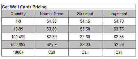
7. Streamline the price chart
You want folks to know it’s affordable – but the full price chart is too much detail. It’s distracting. Put this level of detail on the website.
Then, in the marketing email, say something like “As low as $2.33/deck!”
With just a few tweaks, this marketing email moves from good – to great.